Thursday, April 1, 2010

Diving Mimes, Weeping Czars and Other Unusual Suspects


Trying to find something to use as a cover image for a Ken Scholes’ book is like going fishing with really good bait, or uhm, hunting for ducks at the height of duck season with a really good gun presuming you are a good shot and in this case imagine that you are (even though I’m not a hunter per se, unless my glasses or car keys are involved somehow), or going to bake a cake and you have only the finest ingredients and the most modern kitchen and you have had years of training in the finest French pastry school, even won several awards, Julia Child probably invited you to do a cooking show with her…I forgot what I was getting at here? 

Anyway Ken’s latest, soon to be published, book, Diving Mimes, Weeping Czars and Other Unusual Suspects is a rich and inventive collection of highly imaginative tales. (Get ready for a billiards metaphor) Ken literally runs the table of ideas from an inter-dimensional love story to a Fellini-esque account of the apocalypse. And it is the latter story, Grail-Diving in Shangrilla with the World’s Last Mime that sunk the 8 ball, er, so to speak, and gave me the rich material I needed to create the cover for his book.

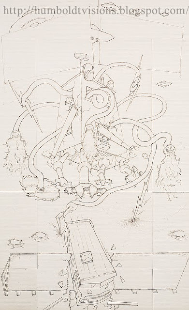
In the story a rag-tag group of protagonists are battling an invading evil alien armada, made up of hobgoblins and large building-like structures with flailing arms that deal out mayhem in the form of fire, bolts of lightning and blades, really sharp blades. Did I mention the canons?

When envisioning the image, I was thinking of something along the lines of Hieronymus Bosch meets Mad Magazine.

So, just to take you on a little trip through the ole creative process, below is one of several rough sketches done on the back of some scratch paper. I know it’s a little difficult to tell what’s going on here, but central we’ve got the killer building itself chasing down the fleeing Winnebago, which is busting through a billboard emblazoned with the author’s name. It should be noted that the billboard is not in the story, nor are the signs above suspended from the flying saucers, but I wanted to incorporate the titles into the image.


Below is the final drawing done for the cover on watercolor paper. If it looks like it was done on several sheets of paper taped together, that’s because it was, for no real good reason (this is warts and all here folks).


From here, I wasn’t a 100% sure how I was going to proceed. Ultimately what I decided I wanted was a collage-like feel, something that would enhance the crazy nature of the image, so I used the drawing as a template and began placing and layering bits and pieces of stuff to create the image, photoshopping in shadows, transforming shapes to fit. In all, there are over 170 layers (different parts) that comprised the final image, (not that I’m bragging or anything). It was a blast to create and when I was finished I looked at it, feeling most pleased, and said “cool”. 

The Radio Magician


Traditional Meets Digital

In today’s world, even for those illustrators who for the most part employ traditional methods, painting and drawing on paper, canvas or board, most have incorporated the digital world into their workflow, somehow. From simply being able to create a digital file of the finished work, to doing post production adjustments with image editing software, to wholly creating their images via digital tools, and varying states in-between.

Ultimately, from the pencil to the computer, these are merely the tools available to artists. What matters is the skill with which they are employed, and the success or failure of the final piece.

For myself, my migration to incorporating the digital world into my illustrative work was a natural one, simply a byproduct of the evolution and dominance of digital photography over film, and my move from the chemical darkroom into the digital one, as illustrated in my previous posts. Ironically it was in the midst of this digital revolution that I began to slide back into using more traditional methods, pencil drawing to be precise, but combine them with digital methods.

The project, The Radio Magician and Other Stories, was a wonderful collection of short stories by James Van Pelt (see previous entry). The title story takes place during the golden age of radio. It is about a boy battling polio, who makes an agonizing solitary journey under his own steam to a radio studio in the city in which he lives to “watch” his favorite radio show. It is a transformative story about magic and the power of the human spirit.

For the cover I wanted to create an image that honored that awe and magic so poignantly expressed in the story. I chose a moment near the end of the story, where the boy with polio visits another boy, far worse off with the same disease,  who is contained within an iron lung in a hospital room. He performs a magic trick for the captive boy, not to raise his spirits, but to inspire him to fight for his life.

After doing some preliminary sketches, below you see the original pencil drawing that served as a framework for the final image.


I researched polio and iron lungs, including their invention and evolution, studied dozens of photographs, then tried to create my own that I felt matched the correct era for the story. An iron lung does what it sounds like it does, through compression and decompression within the large chamber it breathes for the occupant. The occupant who remains prostrate on his/her back views their world through a mirror tipped at an angle above their head.
Through the mirror I could show the face of the occupant, below is the separate drawing that I did for that face that was scanned and inserted separately into the drawing. 


Then in Photoshop I began applying layers of transparent color, much like in a watercolor painting. Below is an early state.


From there I continued to add texture and layers of semi-transparent color to strike the mood. Note the red stage curtains that frame the picture. I wanted the image though it took place in a hospital room, to have a theatrical feel, which was consistent with the magical realism of the story.


Finally I added the text layers and chose a font that had an old fashioned marquee-like feel. I then shot some rays of light through the lettering to complete the image.

I really love this image, just like I loved the story that inspired it. There is some really beautiful detail and color here. Some close up examples below.

 
Later I employed and explored these same methods in the Annathena pictures.


Monday, November 2, 2009

Summer of the Apocalypse

Below is an essay I wrote for the above image which was done for a book cover.  Though somewhat technical, I hope you find it interesting as I reveal the process I went through to create the image.

Illustration for:
Summer of the Apocalypse

A Photoshop Diary

By Paul Swenson

I was asked to create a cover illustration for the science fiction novel Summer of the Apocalypse by James Van Pelt.  The story presents a dual narrative.  An old man living in a post-apocalyptic future, looks back on the summer the world ended when he was a teenage boy and he lost everything, including his mother, and father, the latter of which with whom he shared a tempestuous relationship.  As he reflects back on his past, he decides to journey out from the small primitive community in which he lives in hopes of finding something that he can bring back to his “village” that can lift them from the technological dark ages they now find themselves in.  The past, present and future are revealed to us in equal parts as the story unravels.

My hope was to create an image that captured many of the fascinating aspects of the story.  The narrator as young and old at once.  The cold, dark aged, present and how it was shaped/ influenced by the explosive and destructive past.  And finally I wanted the illustration to reflect the importance of books and the written word, which in the story symbolizes knowledge, hope and the destruction of the same.  So the main image presents the old man in his present life, in a Colorado landscape, his gaze directly confronts the viewer.  The color is cold and saturated.  Burning through the present, as though the cover of the book itself has been scorched, is a symbol from the past, himself as a young man.

The picture is comprised of 5 main elements, The old man, the young man, the foreground landscape, the sky, and the burn mark. 

COLLECTING
After doing some preliminary pencil sketches and working out general composition issues I set out to collect the images.  Pictures were taken of the old man- a family member, the young man- a neighbor kid, the Colorado valley setting was local farmland, and local eastern sky just past sunset served as the sky in the picture.  All pictures were taken as RAW files with a digital camera and downloaded into Photoshop.

THE OLD MAN
Much of the initial color temperature, saturation, contrast and exposure were set in the raw file converter before it was opened into Photoshop.  From there the image was further processed, shadows and highlights shaped and modeled by many successive curves layers, my favorite type of adjustment layer.  Occasionally a hue/saturation layer was applied to further intensify color. Typically areas, like the old man’s eye, are lassoed, feathered and then the layer is applied.  In all, about ten layers were applied to model and intensify the old mans face.  Further, to give the image a more dreamlike and painterly feel, the paint daubs filter was used and then adjusted down using the fade command in the edit menu.  Finally, the old man’s ears, shirt and back edges of his head were lassoed, feathered, and then a small amount of Gaussian blur applied to shift further emphasis onto the faces.

GROUND AND SKY
The same general methods employed in the processing of the old man’s face were used to get the proper, near dusk, feel and dramatic tone.

Note: the top area of the illustration was left open intentionally to leave room for the book title and author's name.

INITIAL CUT AND PASTE
Once these three elements were completed, man, foreground and sky, they were pasted one on top of another, beginning with the sky as the bottom layer.  The sky from the foreground image was carefully cut away using the magic wand and magnetic lasso tool in concert, then the selection feathered ever so lightly to soften the transition edge.  The foreground was then pasted on top of the sky.  Finally the image of the old man was cut free of his original image taken in his back yard and pasted onto the foreground.  In each instance of cutting and pasting, the transform tool was used to properly size and scale each image.

THE BURN
After wrestling with ideas on how to render the illusion of the page being burned away to reveal the image of the young man beneath, I decided the easiest way, or the way that best suited my sensibility was to actually burn the image and photograph it.  Several high quality prints were made on matte paper.  Then one at a time I painted accelerant onto the area I wanted burned, set up my camera and lit the picture on fire.  Through trial and error I was finally able to achieve a burnt area that simulated the shape that I wanted.

NOW THE TRICKY PART
The photograph of the burnt print was opened into Photoshop and everything but the area that had been burned away was selected and pasted onto a blank canvas so that subsequent layers, such as the image of the boy could be slipped underneath.  The image of the boy was turned, and transformed with slight skewing and warping so that the shape of the eye and the boy’s resemblance seemed to be a credible match to the old man.  Some slight motion blur was applied to the boy’s face to add a more dynamic element to the image. Further images of the burn were pasted and cut onto the image to give the onion peel, papery layer feel to the edges.  Then the burn was further processed, edges painted black and brown, and shadows added to give the illusion of depth beneath the surface of the page. 

Wednesday, August 26, 2009

Talebones Present


This was my first fully digital illustration, and it was for a Talebones cover.  (See previous posts) Though still a collage, it was created completely with a digital camera and Photoshop.  Well, almost.  I forgot the face was scanned in from an old b/w photo. For this cover I wanted to do something overtly science fiction, but again in an unconventional way.  The concept was a junkyard astronaut.  Picture, perhaps, a man stranded on a world, where he must piece together a spaceship and spacesuit out of the relics and remnants (junk) of a dead civilization. Kind of a "green" astronaut (hey, I told you I was into recycling).

To collect the fragments of his space suit, I rode my bike around town with my camera looking for appropriately deteriorated and dented automobiles.  I then cut out the choice parts in Photoshop, and built the astronaut's suit layer upon layer, warping the shapes as needed and adding shadows to complete the illusion. Dig the duct tape on the yellow piece and what appears to be a bullet like hole right through the middle of the Cadillac emblem.  The moon is a hubcap from a VW wagon. and the face, that's me - a photo taken some 20 years ago.

Talebones Past

If you've been following my blog, you've noticed that I like to discuss the process that I go through when I make these pictures, in a kind of nuts and bolts way.  For me, as an artist, that's one thing that I find fascinating about other artist's work.  Whenever I pick up an art magazine, I skip right past those long verbose articles written by critics, but when I stumble on the artist's own words, I'm glued, and to the pictures too of course. So it's my hope that whether you're an artist, a writer, a publisher, an avid reader, or just a plain old blog eater, that you'll find what I have to share, both in image and words, interesting.
 
Above was my first cover for Talebones (see my posts below), and my first color illustration, considering all the interior illustrations were always black and white.

Cover images were intended to be conceptual, and not to illustrate any particular story within.  Most often, due to the nature of the magazine, they were very genre specific, space ships and aliens, which though  interesting, I didn't always feel fit a lot of what the inventive authors in the magazine were writing about.  There definitely was a dark fantasy element to many of the stories, and I wanted to create something that captured that feel and was very different from what had been done before.  With that said, you could say there is a kind of tribal/alien chic going on in this picture, but hopefully in unconventional manner. The model was my 4 year old son, who loved any excuse to have his face painted.  And me being trained in the fine arts as a painter, loved the idea of being able to combine painting, photography and collage.

Zombies, Scrap Lumber, Scissors and Gluestick


Here's another piece from the same period as the two posts below. Just to show you something with a slightly different mood.  This was a cover for a surreal collection of short stories by Mark McLaughlin entitled Zom Bee Moo Vee and Other Freaky Shows. I wanted to create a tongue in cheek image that was reminiscent of the old late-night horror movies that were so bad (read funny) that they were good.

Pictured above is poor short order cook Stuart, in the beach snack shack hiding from a zombie attack, armed with only his spatula, but to no avail.  The zombie is busting through the boarded up order window.  Keeping in the spirit of low budget B movie productions, the window is the same one used here.  I'm a big believer in recycling art supplies.  The zombie is my next door neighbor, and Stuart (not his real name) was my co-worker.  They were photographed separately and collaged together, again with good old scissors and glue stick.  There is no doubt a cut and paste feel to these pieces, and that was intentional. It's real and unreal at the same time. I love the affect.
The story does not end there, below, we see the horrible result, which appeared on the back cover. Of course, this is what happens when you lose your head.


Again, this is all collaged in.  I built the little snack shack (12" high in real life) out of scrap lumber and photographed it in my kids' sandbox.  The plastic hot dog I borrowed from my niece.  I drew two lines in the sand with my fingers and then collaged onto the final picture the prone image of Stuart having been forcibly pulled and dragged from the shack.  It's not a flawless, seemless illusion, but then it's not supposed to be, just like a B movie.

Tuesday, August 25, 2009

Another Photo Illustration

Here is another favorite of mine from the Talebones days.  The story was called Behind the Wheel.  This was the tale of a dark love affair, tinged with erotic overtones.  I love the form and the light.  That neck is unreal, beautiful; it seems to go on forever.Yes, it's true that many of the of the stories I illustrated back then were dark in nature.  I think it's interesting to contrast these with the recent work I did for Mrs. Annathena Gilly Gully From Puddle Rumple Tilly Willy.  As an illustrator, I endeavor to capture the spirit of whatever project I am working on, be it adult or child oriented, and use the wide range of skills that I have at my disposal to achieve my goal.

Photo Illustrations

I have to give a shout out to my brother, Patrick Swenson, for helping me get started with all this.  Patrick runs the successful  Fairwood Press, which specializes in science fiction and dark fantasy.  Fairwood Press now publishes novels, short story collections and more from some very fine authors.  Over the years, I've had the privilege of illustrating and designing the covers of some of these fine books.
It all started back more than fifteen years ago when Patrick decided to follow his dreams and  begin a small sci-fi magazine called Talebones. It was a labor of love for many involved.  He asked me, along with a small group of other artists,  if I would be willing to contribute pictures for the stories.  It was the kind of creative challenge that I loved. How do you capture the essence of a story in a picture, wrap it in a little bit of mystery, and tease the reader into diving into the story?  At the time I was working for a photographer, and the full on digital age had yet to arrive. For most, including myself, the concept of Photoshop was still a distant thought. At that time, though my background was in painting and drawing, I was drawn to the idea of somehow using photography to create the images.


Part of me thought it would be easier making a photographic image, than the time that would be required to make a drawing.  Yah, Right!  Take this picture for example, it's from a haunting little story called The Same Song Every Midnight. The idea behind the image above was to depict haunting or disturbing music coming in through a window.  I used the literal image of sheet music to symbolize the non-corporeal concept of the sound of music. For the window, I built the crude shape myself out of scrap lumber and duct taped broken shards of glass to the back of it to provide the illusion of shattered glass. I photographed the sheet music separately at just the right angle and collaged it onto a photographic print of the window with glue stick.  I then painted on the picture with photographic dyes to create shadows and heighten the illusion further.  I did quite a few of these photo illustrations for Talebones, and to this day many remain my favorites.

Friday, August 21, 2009

Book Design


In addition to illustrating this book, Mrs. Annathena Gilly Gully from Puddle Rumple Tilly Willy, I did the interior layout and design as well. One of the fun aspects to this project was to splash some personality throughout the book through the use of small thumbnail sketches. These are simple little drawings that I had a lot of fun doing. They really help to enrich the reading experience. Again, if you want to learn more about the book, feel free to swing by the author's website, or email me by clicking on my profile.

Monday, August 17, 2009

Judge's Waiting Room - detail


To get the kind of accurate detail and line quality I wanted in the judge's portrait, I needed to be able to draw it bigger than the original drawing allowed for. I'm no Jan Vermeer, I can't work in miniature. But I wonder what Vermeer could have done with Photoshop? (I know, the thought is Art sacrilege! I take it back.) Anyway, I drew the judge's arm and gavel as it is reflected on the table's surface, scanned it and inserted it into the picture frame. It's a nice little drawing within the drawing. Though maybe not worthy of Vermeer, but more Rembrandt like like in the lighting I think - kidding!

The Judge's Waiting Room

Here's another illustration from the Annathena project.
One of the challenges to illustrating this story was that, other than the principle character, Annathena, the other main characters, the Judge, the Mayor, the Teacher and the Lawyer, and a secretary had to remain gender neutral so the reader could imagine them as either man or woman. When I was trying to imagine the pictures one might find hanging in a Judge's office, I thought it would be logical to find a portrait - but I couldn't reveal whether the judge was a man or woman. Hmm?
I came up with the idea of a portrait of just the judges arm swinging a gavel. At this moment in time Maurice the parrot is causing a disturbance. The secretary (out of frame) is swinging a broom at him. The man on the right who was coincidentally reading Tropical Bird Digest is acting quite startled, as is the woman on the left, but it also appears she could be disturbed by the gavel swinging down on her from the picture, or perhaps the bee buzzing around near the ceiling, which has developed an attraction for the flowers on Annathena's hat. There's a lot going on in this picture and I had a lot of fun making it.

Annathena Cover Studies


I do love to draw, and I love line. All the drawings for Annathena were originally done in pencil, then scanned and colored in photoshop. The top image was not the first drawing I did of Annathena, but it was the image that would become the model for the character, and the cover. You can see how the image changed, the hat and the parrot of course, and the detail in the hair. Also note the large bag. If you look at the final cover, there is even more detail to the hat that has been added after the original.

Annathena - Sidewalk Picture

Here is the final version of the picture from the previous post. Guess what? The author decided that there should be a pet parrot on the hat. I embellished the hat with more flowers and feathers and added detail to the background. I love looking at the before and after drawings. I think it's fascinating to watch an image as it develops. I hope you find it interesting as well.

Annathena - Early Study

Usually the way it works is I get a complete finished manuscript to work from. For my most recent project, Mrs. Annathena Gilly Gully from Puddle Rumple Tilly Willy, there was a more collaborative spirit to the enterprise. The image at the right was an early study for a picture in which our main character is being pursued and teased by some young children. On a whim I had decided to add a bird to the hat. You will see in the next post how much the final image changed.

Long Walks, Last Flights and Other Strange Journeys


If you are not familiar with my illustration work, much of it has swayed into the realm of fantasy and science fiction. The cover for Ken Scholes acclaimed Long Walks, Last Flights and Other Strange Journeys, published by Fairwood Press, was my art and design. I'm really at home with any subject matter, letting my imagination feed off the images an author conjures up. I'll get to some more of the fantasy work in later posts, but I thought you might find it interesting to see a little more from my recent project, Annathena.

Annathena Cover


I've been busy wrapping up my latest project, a collaboration with writer Chellis S. Jensen. The book, Mrs. Annathena Gilly Gully From Puddle Rumple Tilly Willy. I encourage you to go to her site to learn more about it. It's my first foray into children's book illustration, but not the last, and I loved it. Above is the cover, which I both designed and illustrated. I want to share with you a little more about this project further on.